Let us consider a sprinter running an Olympic race. He is competing in the 1600 meter run. The first two laps he tries to run with a steady but hard pace, trying to keep himself lead, or in the middle, hoping not to fall too far behind while also conserving energy for the whole race. About 800 meters in, he feels himself start to fatigue and slow. At 1000 meters, he feels himself consciously expending less energy.
At 1200, he's convinced that he didn't train enough. Now watch him approach the last 100 meters, the "mad dash" for the finish. He's been running what would be an all-out sprint to us mortals for 1500 meters, and yet what happens now, as he feels himself neck and neck with his competitors, the finish line in sight? He speeds up. That energy drag is done. The goal is right there, and all he needs is one last push. So he pushes.
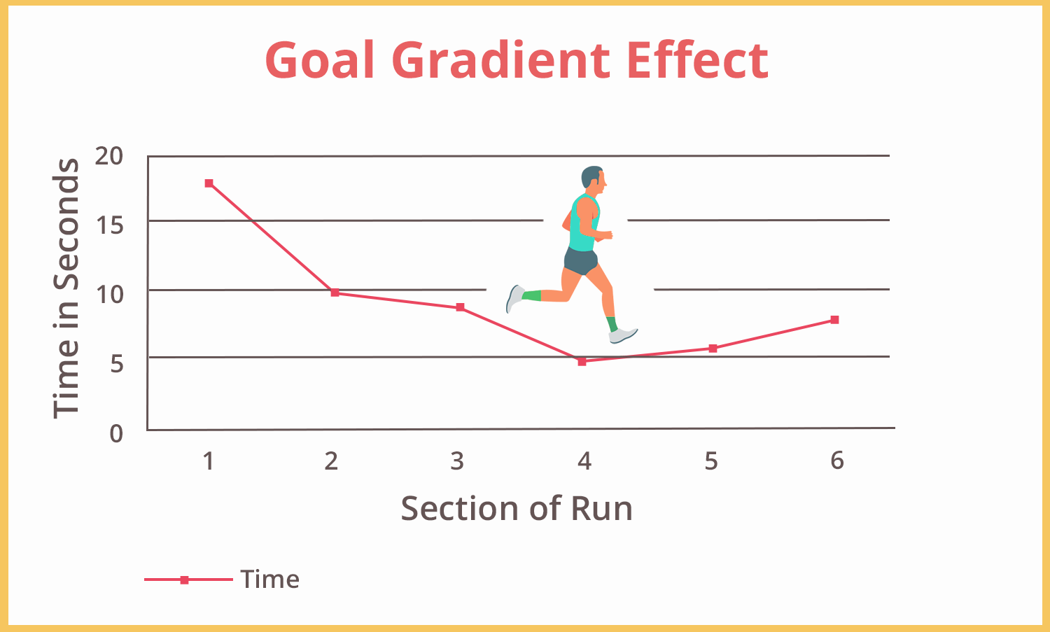
We are all human beings, so we get hit by rewards and conditioning. It's our nature that we get closer to a reward, we speed up our behaviour to get our goals achieved faster. We humans can easily be motivated, that is we can be motivated by how much is left to reach our target, not how far we have gone.
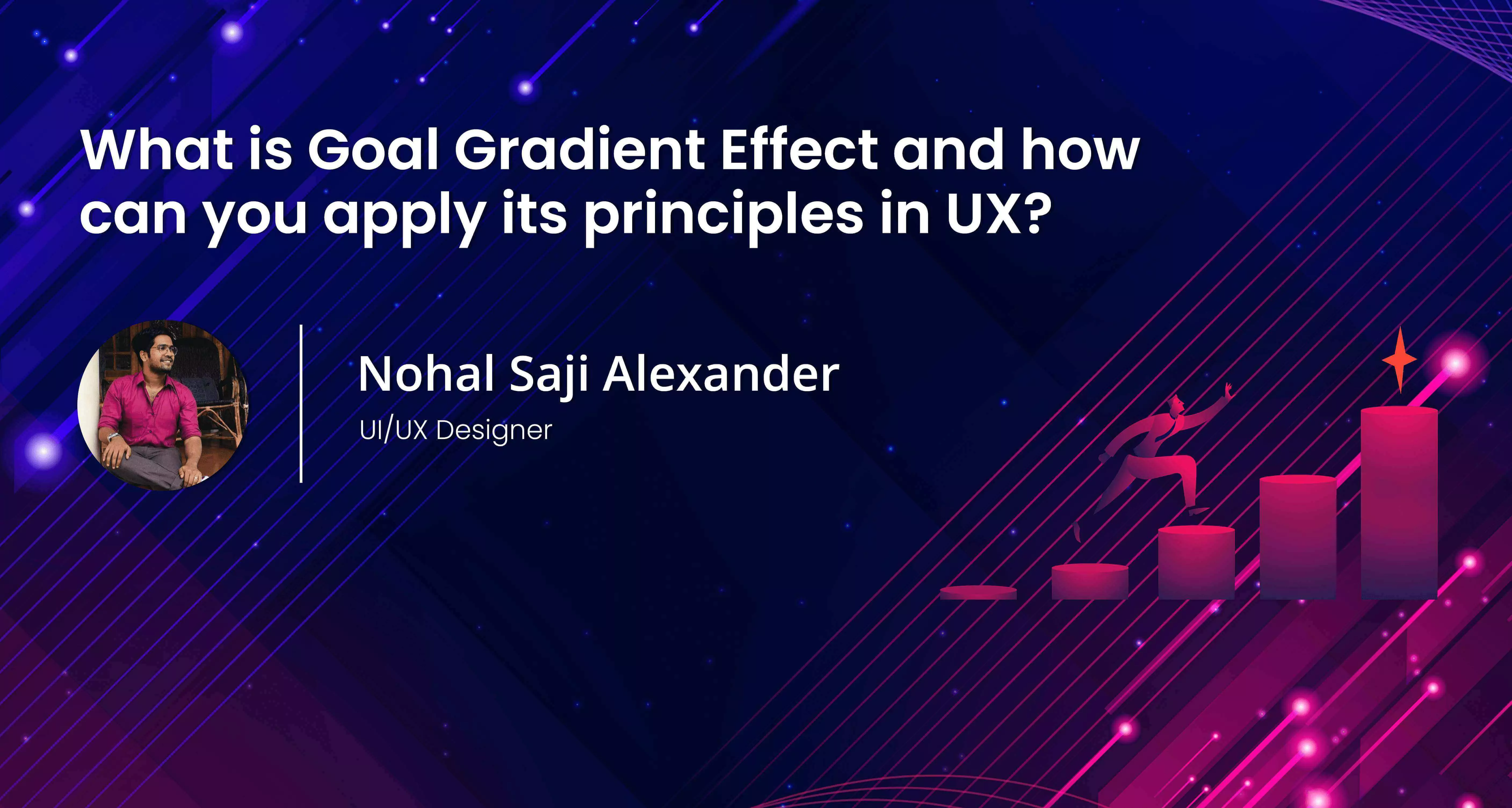
This is called goal gradient effect.
We must heighten the sensation experienced by the user as they get closer to the goal. An example for this is some games using tones as users reach the goal ie, they get it intensified.
We know that the customer would work harder to earn incentives, we all do. As the goal comes within sight and reward is earned, we will slow down our efforts. So to avoid such things we can give rewards that are instant to keep them going and stay motivated.
People tend to act more as they get closer to the rewards. The stronger the customer inclination to accelerate towards the reward, higher their retention rate and quickly they re-engage with the program.
For instance when a user is filling a form we must never create any sort of anxiety or confusion for users while filling a form, as they don't know how much commitment is required. We need to let them stay calm, understand and show them that they are about to reach the goal.
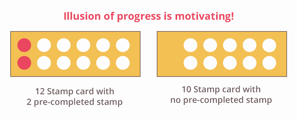
People are motivated by the illusion of progress. A person who is about to win a free coffee from the shop intends to buy more coffee regularly to get the free coffee.
An example, in a cafe reward program, two bonus stamps were pre-completed on a 12 stamp promotional card . Other customers received a standard 10 stamp. So who tends to complete it?
The 12 stamp card as it has already been filled by two stamps. That is because they have given a start or a motive to finish up the rest.
Let's look at a few more examples;
The linkedin progressive bars helps to show progress in our profile. It measures the completeness, "Intermediate", ie, people were made to complete their profile. They have persuaded users so that they get discovered easily.

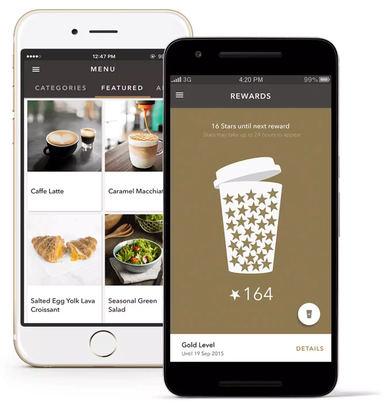
Similarly the Starbucks app drives the user to buy more coffee with a fine reward system. They also provide a user friendly experience and push their customers to keep buying until they achieve their goal.
We can find many examples from our daily life. This is now a useful topic while designing a website or an app. To make users use more of the app or website we must catch their attention with rewards or other means. Make them committed to the procedure.
It is done by:
1. Progressive visualization
2. Gamification
3. Activity tracking
Thus goal gradient can be practiced everywhere. It's human psychology. All we need to remember is that humans tend to act more as he/she is about to reach their goal.
Why don't you share some examples in the comments session below? I would love to hear from you. To incorporate such an effect while creating a website, contact Appiness Interactive, a UX UI Design Company in Bangalore.


