The word Interaction by the dictionary means reciprocal action or influence, an occasion when two or more parties react to each other.
"Interaction Design is the creation of a dialogue between a person and a product, system, or service"
In the digital platform, when the communication is between the system and user, the interface should be able to interpret the information given by the user and respond accordingly to make the interaction effective.
"A deep, cognitive understanding of the human behind the term user, including the user’s memory and decision-making and problem-solving skills"
Doesn't all of this sound like the definitions we give for user experience? Yes, but there’s a subtle difference. User Experience is the overall experience of the product, however, user interaction design is focused on the moment when a user interacts with the product.
The five dimensions of Interaction Design
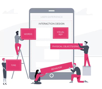
1D: Words
2D: Visual Representation
3D: Physical Objects/Space
4D: Time
5D: Behaviour
Source : Link
The above-mentioned dimensions form the framework of interactions. While the first three dimensions enable interaction, time and behavior define the interaction itself. Using these, the designer can focus on every experience the user will go through when connecting with the product. Let's look into how these dimensions can be meaningfully put together in design.
1D: Words
Words are used to explain the purpose of the action. It is very powerful as it can be directly interpreted and quickly processed by the user. So deploying the right words at the right place is as essential as the functional working of the product.
• Simple to understand
• Conveys its role or purpose
• Positive & encouraging
• Action verbs enable more interaction
• Avoid jargons

Source : Link
The first example is the landing screen of Anima - a product developed for design handoff. The words are simple yet powerful, explaining what the product is all about in just a few words.
However, words can also create negative experiences when not used right! Here in the second example, the call-to-action options are so confusing to answer the question, eventually increasing the cognitive load for the user.
2D: Visual Representation
Visuals are as powerful as words, as they subconsciously interact with the user. Conveying messages through images is widely used, as one of the goals of interaction design is to make the user think as little as possible.
• Imageries, iconography, graphical representations
• Typography - a combination of font style, font-weight, kerning, line height, bold, italic styles
• Hierarchy & consistency

The best example I could pick is the app icon of Clubhouse - an audio-based chat app, which has strongly believed that visuals can be used to create social awareness More Info
3D: Physical objects/Space
This refers to the physical device through which the user interacts with the product. Example mobile or tablet screen, computer mouse or keyboard, joystick. Space refers to the environment the user will probably be at, the surrounding factors that will impact the usage of the product. The design has to accommodate these considerations so that the experience is smooth.
4D: Time
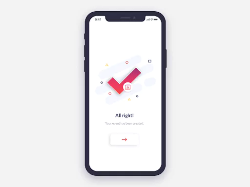
All interactive elements that change over time - sound, film/videos, animation that keeps the user engaged, say in the waiting time. Feedback works best by which we give the user an understanding of the progress of their actions, an affirmation for completed actions, etc. Animations give the necessary pause in an interface to create a greater sense of change or affordance.
5D: Behaviour
It is the emotions and reactions that the user has when interacting with the system, which might continue post the interaction as well. For example, whether the users are feeling satisfied, if the application could lead the user to the intended actions, overall presentation, etc.
Affordances & Signifiers are other potential elements that significantly help in determining the flow of interaction.
Affordance is a feature of an object which presents a prompt on what can be done with the object. Discoverability & feedback is the main key. Different types of affordances can be used, designing the right affordances can mean a better experience for everyone.
The signifier is some sort of signal, to indicate the potential and intended affordances of an object.
1. Explicit affordances
These are the physically obvious hints or any accompanying text to inform the user of how an object is to be used. For example, the submit call-to-action button with a nice shadow tells that it is clickable; the way the handle of a car is designed is easily affordable for the user.

2. Hidden affordances
The clues that indicate an item's function but are not obvious and may not even be displayed until the action is being taken. A good example that I came across recently is this swiss torch. I pretty well knew the main purpose of the product, but wasn't aware of its expandable feature until I read the manual!

3. Pattern affordances
Pattern affordances go by the conventions. They are great for communicating mental shortcuts, but only if the users are aware of these patterns. So, the more patterns users learn, the clearer is the navigation with the product. Because the capacity of short-term memory is limited, designers should take utmost care to use simple features that users are already used to.
4. Negative affordances
It might sound strange, but negative affordances also play a big role in a positive user experience. The purpose of a negative affordance is to give users a prompt that some elements or operations are inactive at the moment and that they cannot be used. It is most necessary when we do not want the user to waste time on less important things.
4. Negative affordances
False affordance is what designers should avoid. These are the wrong prompts that lead users to unintended action or different results, not the one which is expected behind the prompt. Such experiences will not just confuse the user but deviate them from achieving the goals.
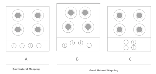
For example, the design of a cooking stove in image A creates a cognitive load as it's not clear which knob corresponds to which burner. While images B and C are the best mappings, as the knobs are placed in the same orientation as the burners making it intuitive for the users.
Takeaway
A designer's job is to make every small encounter with the product a pleasurable one. Affordances are a great way to enable users to interact with ease. Meaningful feedback is also necessary for good interactions to happen. The connection between the action and the result should be made obvious so that people know what happened, why it happened, and what they should do next. Good interactions contribute to a good user experience. Hence, you must invest in the reliable UX Design Agency in Bangalore.
Appiness is one of the top UI/UX agencies for Interaction Design Service in Bangalore, our team of skilled and professional UI UX Designers provides responsive UX UI Design services to improve the user experience of your website.


